Color psychology: how your home palette shapes your mood
🚀 Key Takeaways
- Core concept : Color affects mood through biology, culture and context.
- Practical tip : Use muted hues for rest, blue/green for focus, warm accents for sociability.
- Did you know : Pantone announcements shape trends but personal light and texture matter more.
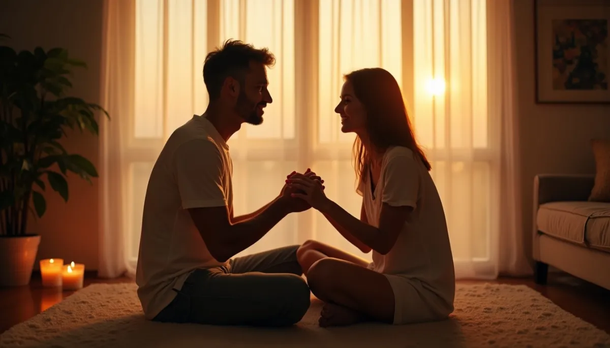
Light changes, and so does what you feel. Imagine waking in a bedroom washed in soft dove blue, early sun slipping along linen curtains, breath slowing as if the walls themselves invite calm.
Couleurs et instant
The link between color and mood is visible everywhere, from the red of a restaurant logo to the sage paint chosen for a nursery. Designers and neuroscientists increasingly study how hue, saturation and brightness influence attention and emotion. Practical results appear in offices, hospitals and hospitality venues where color choices are strategic.
In 1810, Johann Wolfgang von Goethe published his theory of colors, arguing that color perception carries emotional meaning, long before neuroimaging could measure activity in the brain. Today, experiments such as those by Mehta and Zhu (2009) show that blue can improve creative tasks, while red sharpens attention to detail. These studies give rules of thumb, not absolute laws.
On a social level, public institutions set examples. Pantone’s Color of the Year, announced annually since 2000, has influenced interiors and retail. In 2020, Pantone 19-4052 Classic Blue was widely adopted, creating a calmer visual language in showrooms and living rooms when the world needed steadiness.
Racines et raisons
Why do colors move us? First, biology matters. Human vision evolved to read environmental cues, like ripe fruit or fresh foliage. Certain wavelengths trigger physiological responses: warm tones can increase heart rate, cool tones tend to lower it.
Second, culture writes another layer. Red means luck in China, while in parts of India it signals celebration. White is associated with weddings in the West, and with mourning in some East Asian traditions. Your background shapes the palette of emotions you bring into a room.
Third, context and material change everything. A saturated red on a glossy wall reads differently than the same red on a cotton throw. Light temperature, window orientation and surrounding textures moderate a color’s psychological effect, which is why designers test swatches in situ.
Usage et nuance
Translating research into home choices requires nuance. For bedrooms, studies and sleep specialists recommend muted blues, greens or warm neutrals to promote rest. A 2017 survey by a sleep charity found that 60% of respondents felt calmer in rooms painted soft tones rather than vivid colors.
For productivity, pale blue or green backgrounds support sustained attention. Mehta and Zhu’s work suggests using red only where detailed focus is needed, for example on labels or checklists, rather than as a dominant wall color that could induce stress.
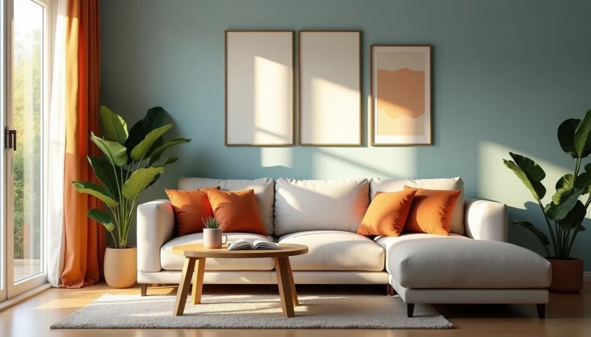
In living rooms or dining areas, warm terracotta, ochre and soft rose foster conviviality. Hospitality designers often pair these with natural materials, proving that color plus texture creates memorable atmospheres, as seen in modern Nordic cafés since the 2010s.
Prudence et perspectives
However, color psychology is not deterministic. Personal memory, emotional states and individual differences mean reactions vary. An intense blue may soothe one person and feel cold to another who associates it with loss.
Trends also evolve. What felt modern in the 1990s, like all-white minimalist interiors, shifted to warmer, more layered palettes in the 2010s. Designers now emphasize biophilic color schemes, integrating greens and earth tones to respond to urban stress and climate awareness.
Practical approach: test small patches at different times of day, consider finish (matte vs gloss), and pair bold hues with neutrals. Let light, function and personal history guide you. In short, choose colors that answer how you want to feel at home.
Thanks for reading, and don't forget, Enjoy Life Moments!